OVERVIEW
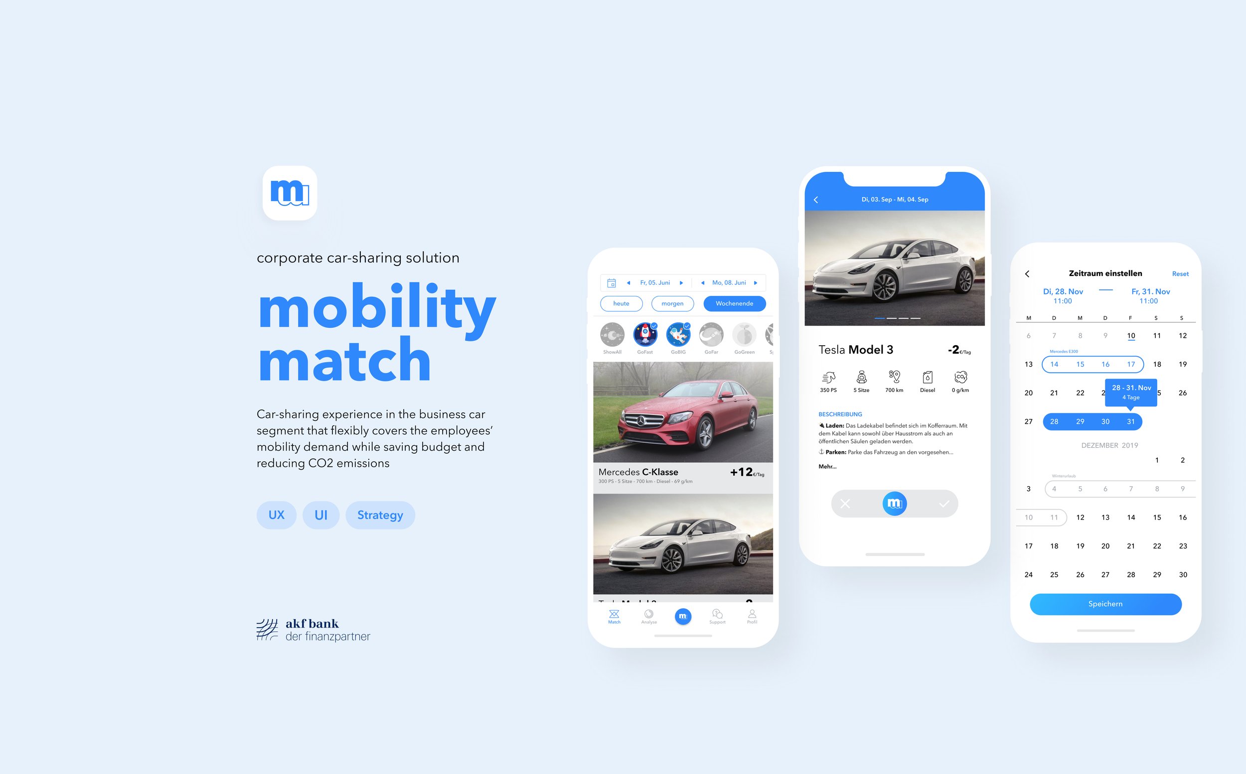
mobility match is a corporate car-sharing solution that flexibly meets the employees’ mobility demand.
With this strategic product, akf servicelease established a unique selling point compared with the conventional fleet services of competitors.
ROLE & DURATION
UX Designer | akf bank
APR 2019 - SEP 2020
My Role
Lead the end-to-end design process from concept, research, design, testing to implementation.
Collaborated with 3 Developers and 1 Product Manager in a cross-functional Scrum team.
What I did
Concept and Strategy
Visual Design
Development Support
Introduction
akf servicelease is a corporate fleet provider partner with numerous medium & large enterprises in Germany. To keep our leading position in the market, we were striving to explore innovative solutions as a unique selling point.
Problem Statement
In conventional corporate fleet service, the employees are usually assigned with a fixed vehicle as their corporate car, which cannot cover all of their mobility demands, and even results in wasted resources and high costs.
Solution
The goal of this project is to design a mobile car-sharing app for corporate car users. The app allows employees to flexibly use the cars in carpool to fulfill their various mobility demands.
Research
User Group Profile丨User Pain Points丨User Needs
User Group Profile
Who are we designing for?
We conducted in-depth user interviews with target users from one of our partner companies.
Then we synthesized the following user group profile through the analysis and affinity diagram.
User Pain Points
In the current context, using fixed corporate cars brings the employees the following key pain points:
Ever-changing mobility demands of business and private usages cannot be fully covered
By choosing a car which could cover as many needs as possible, a higher cost is inevitable
Most target users have demand on long-distance trips, which means e-mobility is hard to play a role.
User Needs
How do target users, top management in enterprises feel about corporate car-sharing?
Ideation
Storyboard丨User Flow丨Wireframes丨Prototype
Proposed Solution
Matching Model
Employees match their assigned corporate cars with each other on themselves, based on their specific needs. Two users with compatible needs can be matched.
Station-Based Car-Sharing
Communication occurs at fixed sites, as employees go to the office every workday.
Storyboard
I created the storyboard to present the core concept clearer to our team and stakeholders with storytelling.
User Flow
Based on the initial concept we started brainstorming out the journey of the 2 users matching their corporate cars using the mobile app as mediator.
After outlining the initial matching process, we advanced this detailed user flow and defined the 4 main steps of the process. This was to further clarify the interaction between the 2 users and the 2 vehicles. The user flow also served as the basis for wireframing.
Wireframes
Card, Button, or Slider?
Design Rational #1
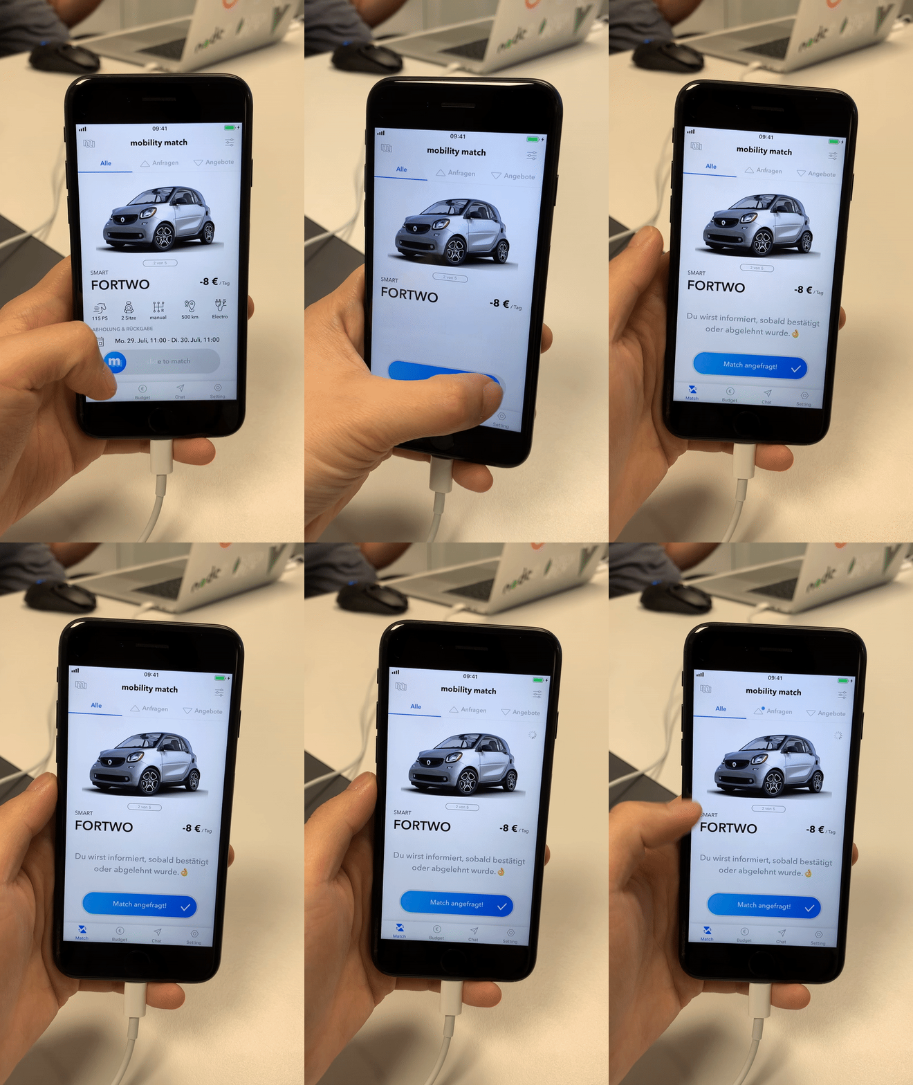
Send a Request
The Matching Initiator finds the desired car based on personal demands in the carpool and uses the single slider to send out a request.
The longer interaction time of this UI element assures enough buffer time for users to make the decision.

Bi-Directional Slider
Design Rational #2
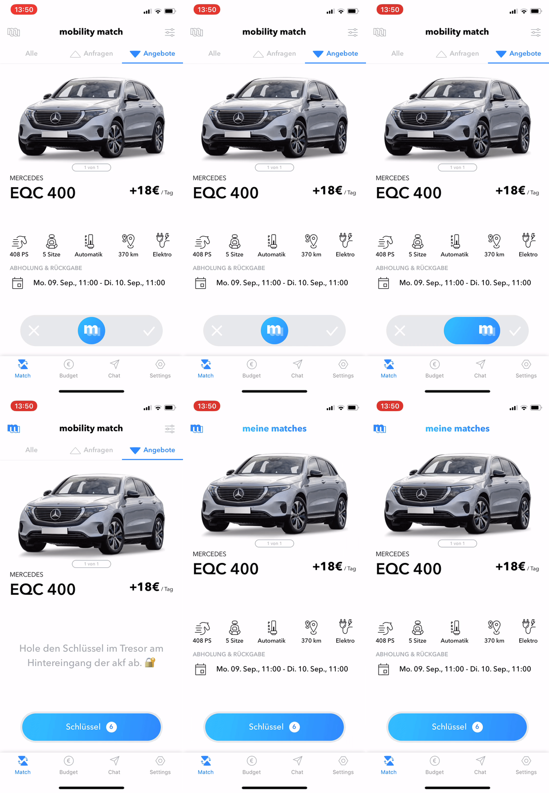
To ensure the consistency of UI components, the confirmation screen of the request recipient also needs according to design, to be able to either reject or accept the requests.
We invented therefore the bi-directional slider.
Accept or Reject a Matching Request
The Request Receptor receives the request from the matching initiator, exam the matching date and characteristics of the car, then decides whether accept to confirm the matching or refuse it.
The bi-directional slider is a UI element invented by our team. It has also a longer interaction time compared with other controls. It provides sufficient buffer time. Its functionality is also self-explanatory.
Testing & Iterating
MVP丨User Testing丨Testing Findings丨Design Refinement
User Testing
To build up the MVP I collaborate closely with the 3 developers in our team. Because our goal was not only to test the mobile app, but also the whole experience, the complete concept.
Testing Findings
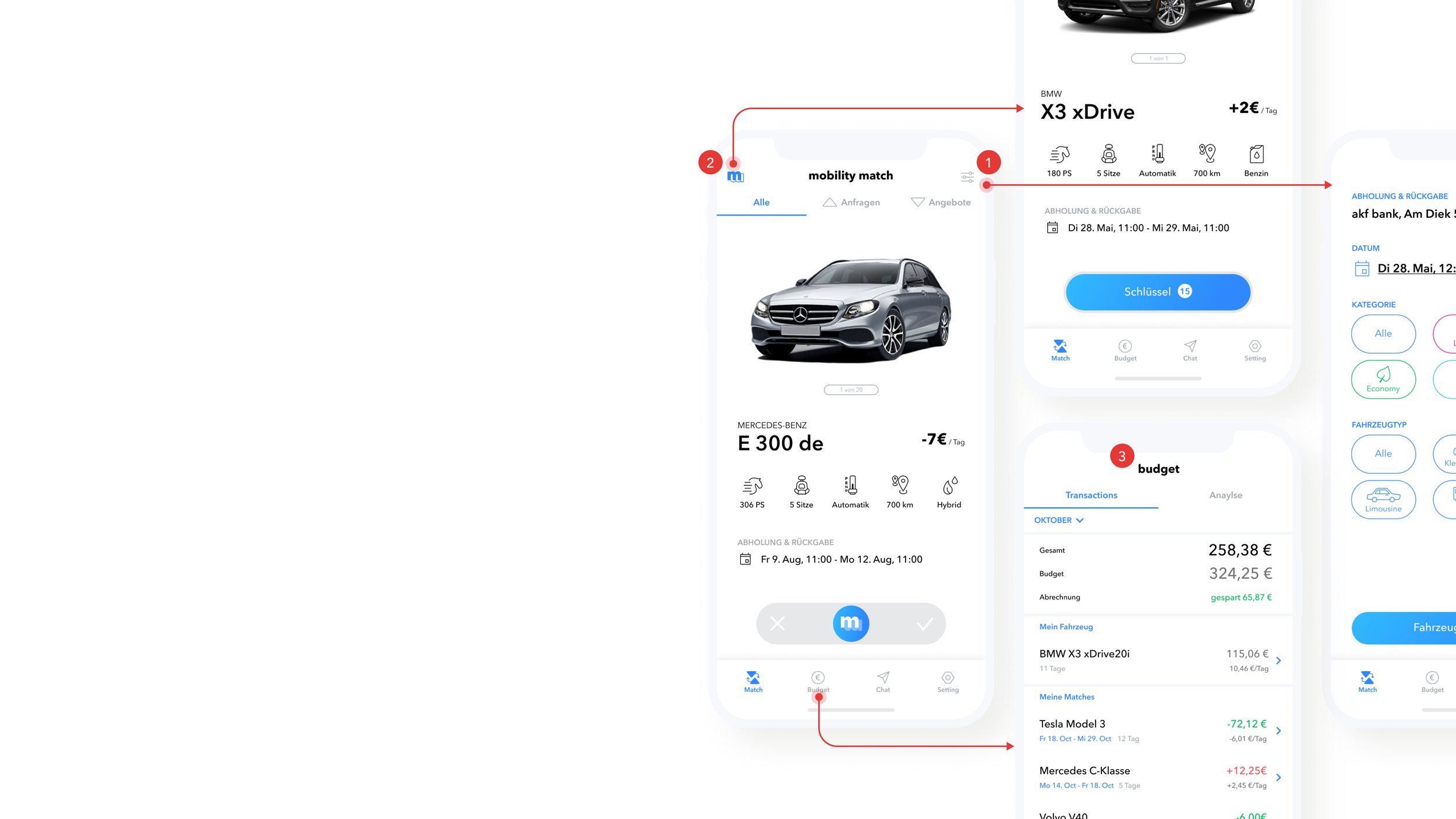
Through thorough user testing, we found the matching experience was well accepted by participants with a 75% user satisfaction rate. We also identified some issues through observation, post-testing questionnaire, and focus group.
Key Issues:
The filter has low accept rate. Participants complained that the filter icon was unremarkable. They rarely used it.
Low visibility of confirmed matching. It took some participants a while to find the confirmed matchings that should be opened via the icon in the upper-left corner.
Budget as motivation is insufficient. Budget savings alone are often not enough to trigger request recipients to accept requests.
Design Refinement
Solution of issue #1 - Itergrating Filter on Startpage
We integrated the filter and speed dials of date options into the carpool screen, making it more efficient to narrow down the search on demand.
Solution of issue #2 - Optimised “My Matching” Entrance
Using bottom navigation as an easier-to-reach position of confirmed matchings and integrating the display of received and sent requests under the same section.
Solution of issue #3 - Scoring System as Matching Motivation
We collaborated with the business analysis team to develop an algorithm of “mScore” as the scoring system of mobility match. It combines the results activation, cost-saving, and CO2 emission reduction.
The higher score employees obtain, the more privileges they can receive, including coupons for free upgrades.
Final Design
Core Features丨Design System丨Illustration
Onboarding Experience
Guiding the employees when logged in for the first time to select and apply for their initial corporate car step by step.
New ride, one slide
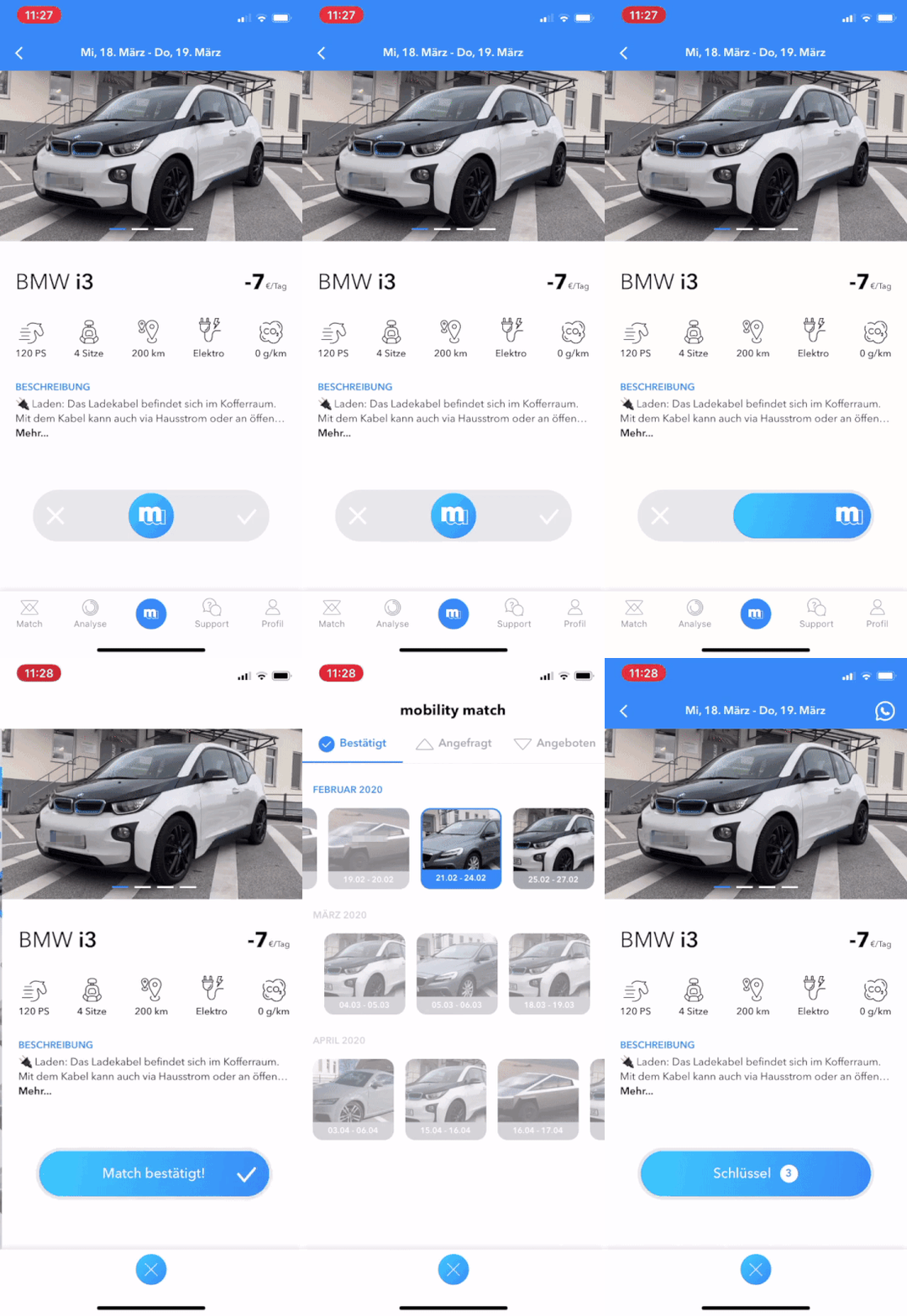
The single slider stays on the final design.
The Matching Initiator finds the desired car based on personal demands in the carpool and uses the single slider to send out a request.
The longer interaction time of this UI element assures enough buffer time for users to make the decision.
Bi-Directional Slider : Combine Functionality and Aesthetics
The Bi-Directional Slider is the shining point of our interaction design. A successful combination of function and aesthetics.
The longer interaction time of this UI element assures enough buffer time for users to make the decision.


